The PMA has a New Look!
The Peterborough Museum & Archives gets a face lift!
We have a new visual identifier at the Peterborough Museum & Archives (PMA) and we’d love to share the journey and the story behind the new look with you!
Part of the Past
Since 2007, the PMA's visual identifier has been a photograph from the Balsillie Collection of Roy Studio Images of children holding hands across an Ennismore road. This photo represented so many things for the PMA at the time - a close connection with our community, including the wider region; a family friendly, inviting environment; award-winning children's programming; and even the PMA's outstanding textile collection!
Since then, the PMA has undergone the process of developing a new visual identifier that better demonstrates our commitment to diversity, equity, inclusion, access, decolonization, and fun of course.
The Little Details
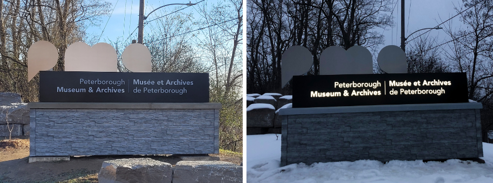
We love the details in our simpler, clear cut visual identifier! The ‘P’ has the shape of a speech bubble, the ‘M’ of a book, and the ‘A’ of a location symbol. The colours were inspired by the Canadian 1967 Centennial logo (i.e., bright, colourful, a little retro) which is a throw back to the year we opened here on Armour Hill, in Ashburnham Memorial Park. While being playful and young in appearance, the colours and shapes are high contrast. These are meant to show the accessibility and inclusivity of the PMA. We know the flexible and fun elements of our new visual identifier will make it versatile and engaging for years to come!
We also have a new sign at the corner of Hunter St. and Museum Dr. with lights on a timer to light it up at night as well.
Decolonizing our Public Brand
Decolonizing our visual identifier was critical in the context of necessary and fundamental changes within the Canadian museum and archives profession over the past 15 years. The settler children in our Roy Studio Image represent just one demographic of our diverse community. Museums and archives must advocate for meaningful truth and reconciliation in all activities and respect the 94 Calls to Action by the Truth and Reconciliation Commission (2015).
We've had a few looks over the years
A change in look is a natural part of remaining closely connected with our community. The results of a Branding Questionnaire, led by Lett Architects Inc. in 2022, combined the feedback of the PMA team, the Museum & Archives Advisory Committee, invested City staff, PMA volunteers and stakeholders, as well as all of you in the Peterborough community. The responses guided us to our final result, an easily recognizable, engaging, and approachable new look.
For all of you who have been with us a long time, you may recall a few our past looks. From 1992 to 2007, our visual identifier was a Penny Farthing bicycle - which led many to believe we were actually a bike museum! Needless to say, much love, time, effort and consideration has been poured into our new image and we're so happy to invite you up the hill to see all that is new and exciting.
Thank you, from all of us at the PMA!
Contact Us
City Hall
500 George St. N.
Peterborough, ON
K9H 3R9
Phone: 705-742-7777
Toll Free: 1-855-738-3755
Email Us